How to Create a Mobile-Friendly WordPress Site
Presently, people spend more time on their phones than on their desktops. And mobile web traffic holds more than half of the total internet traffic. It suggests that you have to make your website mobile-friendly to increase traffic on your website. Therefore, this section will share different ways to create a mobile-friendly WordPress site for users.
Why do we need a mobile-friendly website?
We have a few seconds to grab someone’s attention and convince them to stay longer on our site. If our site takes time to load and does not work properly, visitors will never return, leading to failure.
About half of the visitors probably visit our website on their mobile phone. Therefore, we must improve the user experience and specifically create a mobile-friendly website.
Test your website- Mobile Friendly or not?
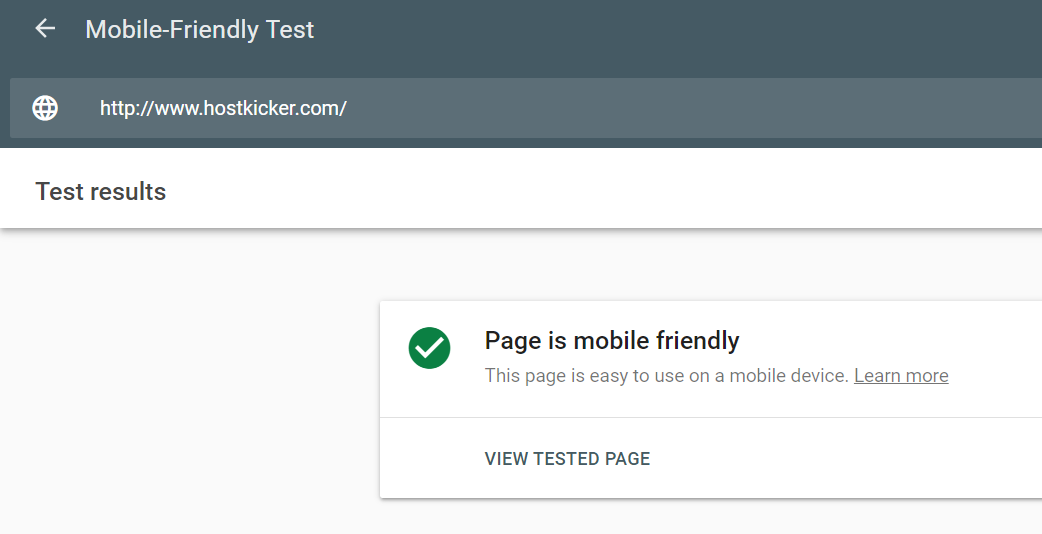
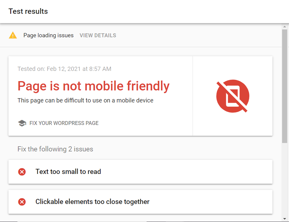
Google provides a tool to test websites and tells whether your website is mobile-friendly or not. To test, you can place your URL in the search box. It will give a green signal if your site is mobile-friendly and turn red if not. You have to work on your site for a red sign and improvise it. You can have a look at it below.
1. Mobile-friendly test result.
2. non-mobile-friendly test result.
Now, let’s step ahead to understand how to create a mobile-friendly WordPress site by using plugins.
1.WPTouch Plugin
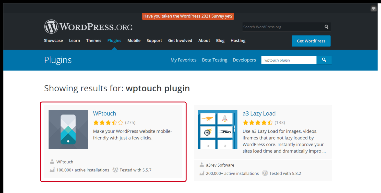
WPTouch is a plugin that helps your WordPress website to fit any screen.
It optimizes your site for the different screens without changing your desktop site or content. It is easy to use as it automatically modifies your WordPress site to a mobile-friendly theme when your site is accessed with a mobile phone.
2. Smush plugin
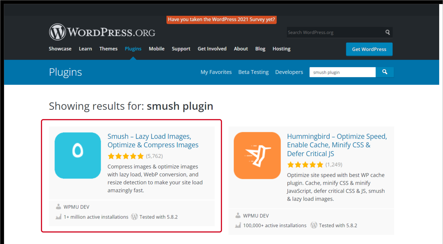
Smush is an image optimization plugin for WordPress which handles page performance. It automatically compresses the image size under 1 MB when you upload them without a drop in quality.
Also, you can upgrade to Smush Pro ( payable ) if you want to compress files to a greater extent.
3. WP Mobile Menu plugin
Mobile phones with smaller screens give a navigational challenge as they limit display screens without the header and sidebar menu space, leading the user to struggle with the next step.
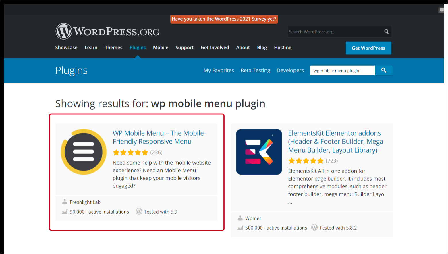
WP Mobile Menu is the popular Plugin for this. It adds up a responsive three-layered mobile menu to the website. It offers display layouts such as slide over, slide-out and hides menus when they reach the desired page.
4. Jetpack Plugin
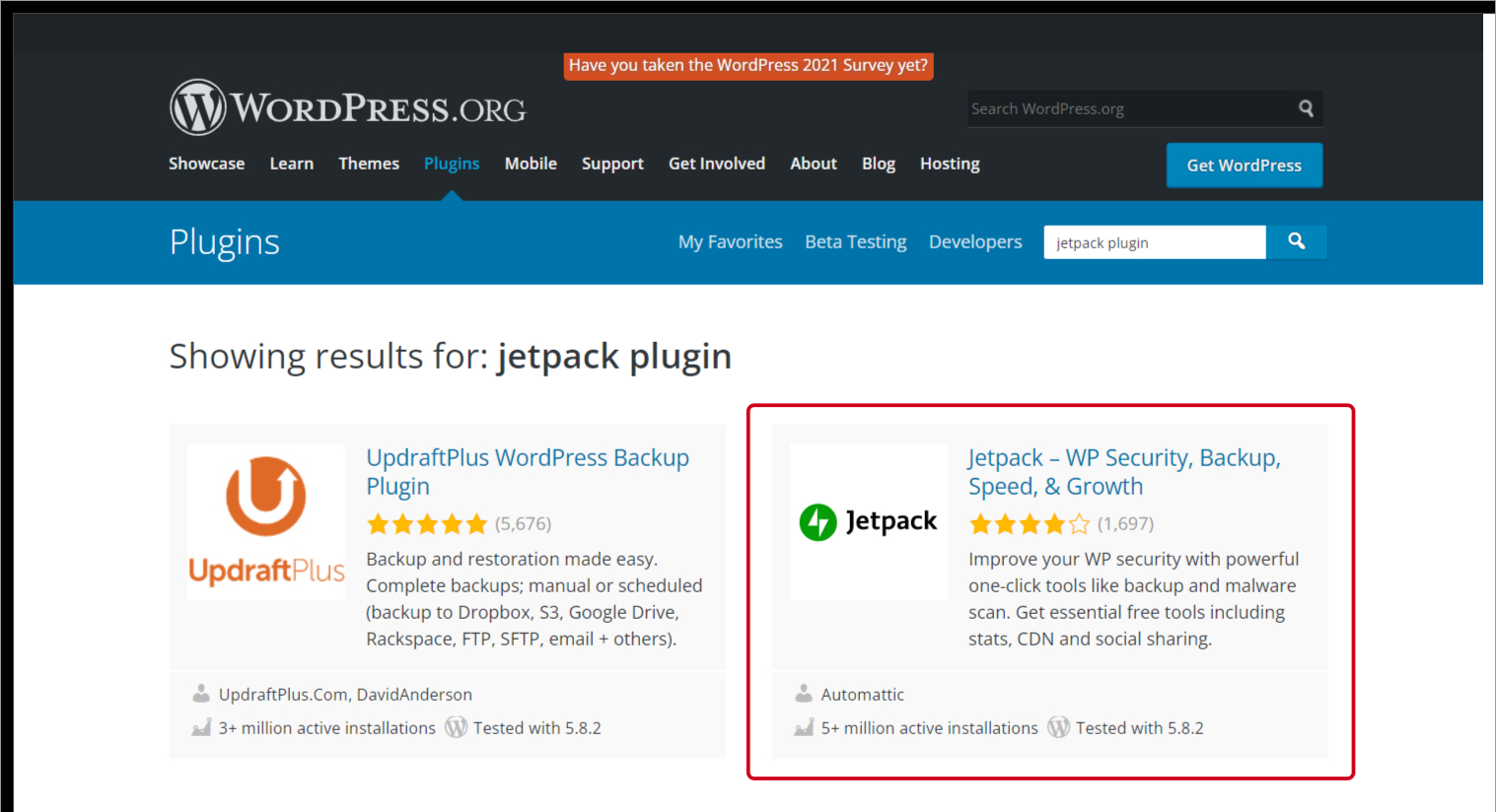
The jetpack is an all-in-one, mobile-friendly Plugin with lots of features.
Such as enhancing the site’s marketing, improving sites security, SEO analytics, enhancing the site performance, and a lot more designing tools.
These features help us to shorten the number of plugins on our site.
5. AMP for WP
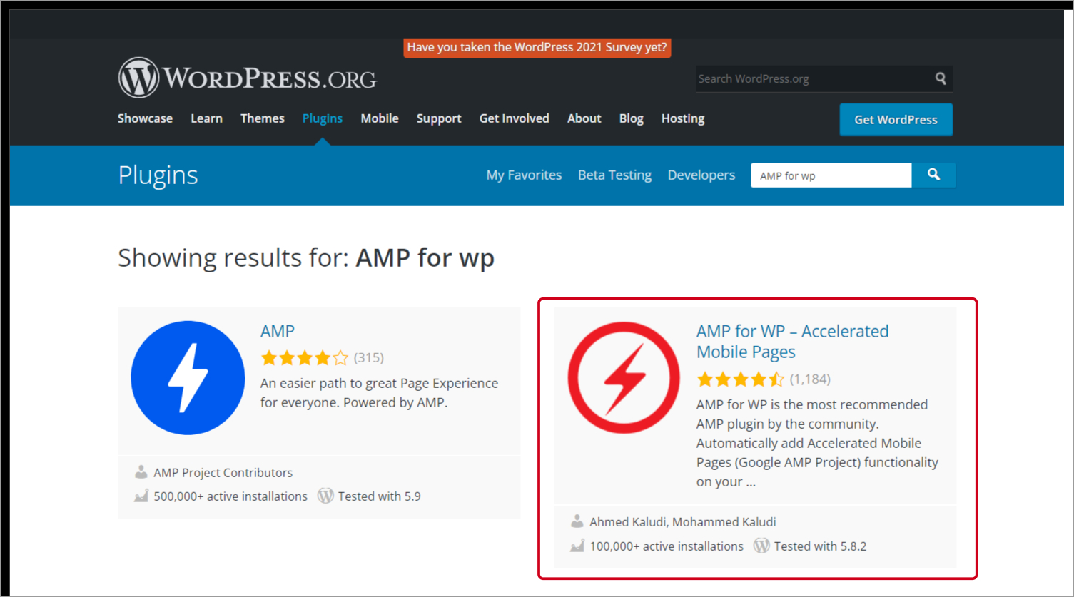
AMP is an HTML framework presented by Google, intended initially to optimize web pages for mobile devices. It now involves web pages shown across all devices. It formats your website’s pages into a mobile site to function more efficiently on smartphones. Also, it is compatible with other plugins such as WP Forms, WooCommerce, and many more.
It boosts up your google ranking as you improvise your user browsing experience.
6. Autoptimize plugin
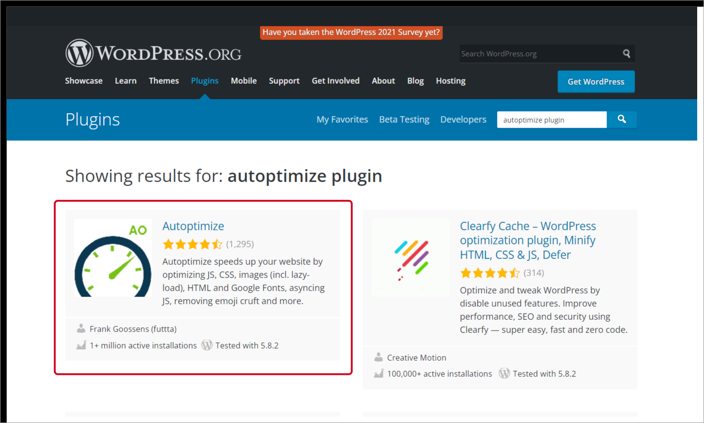
The Autoptimize plugin is free and one of the best plugins to improve upload speed and reduce the site loading time by up to 30%. It also Optimizes the database, deletes the cache, and aggregates scripts.
7. Max Mega Menu Plugin
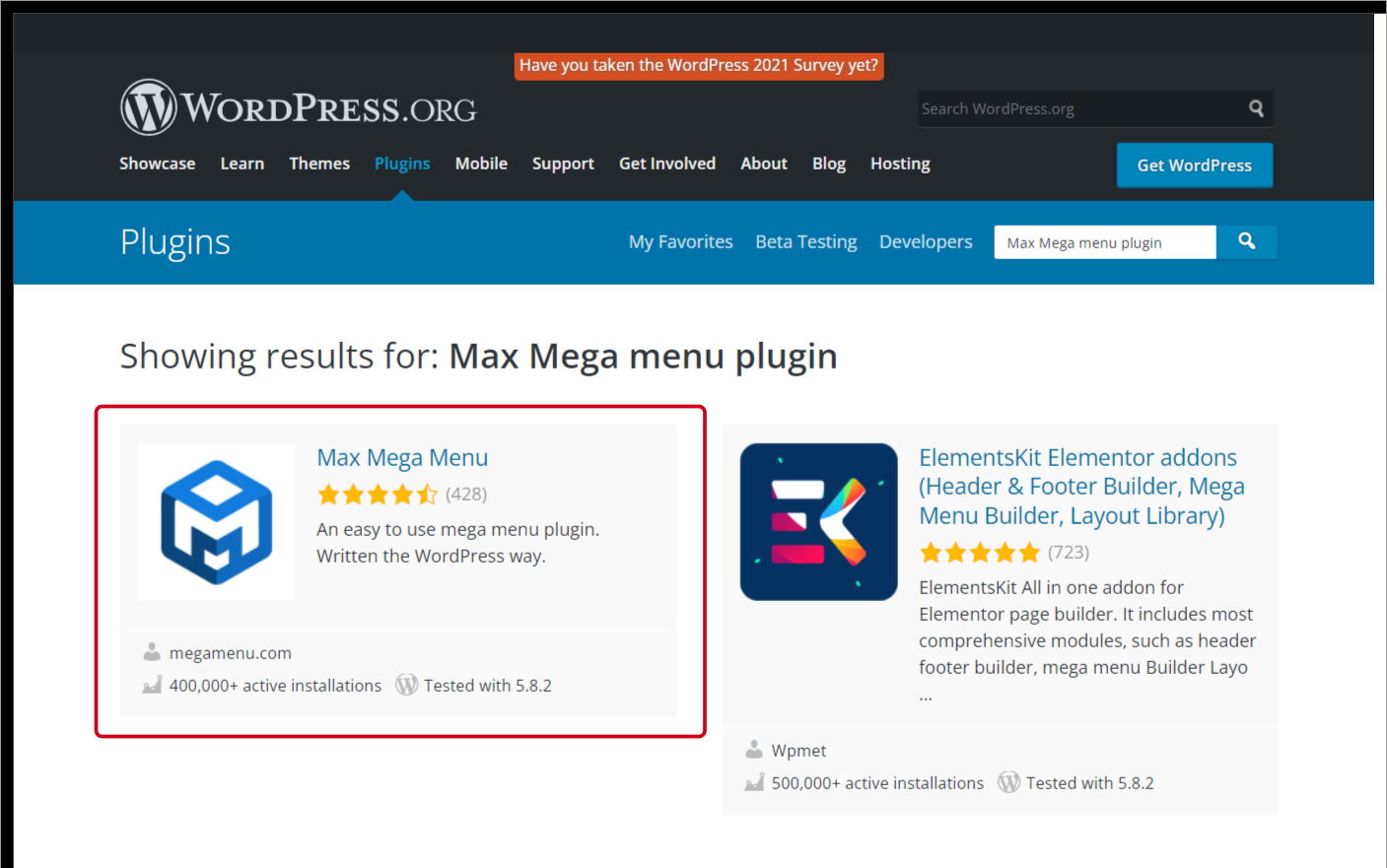
The Max Mega Menu plugin is popular for mobile menus. It is good for websites with vast pages and navigation. These websites require large menus, which are challenging to implement on mobile websites. This Plugin converts your existing WordPress menus into mega menus and pays attention to responsive design.
Other than plugins, the following ways can help you create your website mobile-friendly.
8. Using Standard Fonts

Some fonts are difficult to read on mobile screens and lead the user to a poor experience. While writing your content, you must consider font size and font style. Therefore you should use Standard fonts like Open Sans and Droid Sans, which are easy to read, even on a mobile phone’s smaller screens.
9. Links with Enough Space
Mobile Phones have smaller screens, so sufficient spacing should be present between the links. It’s important that visitors won’t accidentally tap on the wrong URL.
10. Lower the Pop-Ups count.
If you want a mobile-friendly website, you should avoid pop-ups because displaying them on your mobile screen can irritate visitors. Also, it might lead them to a new page. Therefore, it’s best to disable pop-ups on your mobile website altogether. You can reduce pop-ups and use them strategically if you want them for promoting purposes.
11. Turn Off Autocorrect on Forms
If your site offers form fields, you should turn off the autocorrect feature from all the form fields. Visitors may find it difficult to fill up forms as names or email addresses may change with common words, and Sometimes autocorrect changes the meaning of the entire word.
To turn off autocorrect, add the code in the input field of your HTML.
autocorrect=" off"
The updated input should look like this:
<input spellcheck="false" autocorrect="off" type="text" />
12. Viewport Meta Tag
The meta tag is an easy way to control the scale of the screen to display on different devices correctly.
This meta tag notifies browsers to fit your web page to the particular screen visitors access the site.
Place the code into your website’s HTML page’s <head> tags to apply meta tag.
<meta name="viewport" content="width=device-width, initial-scale=1">
13. Button Placement on screen

The call-to-action (CTA) buttons must be placed strategically on the screen. The buttons should be large enough to tap with a thumb, as most mobile users use their phones with a single hand. Therefore, you should place your CTA in a convenient location for one-hand usage. CTA button in the center of the screen is more convenient to reach than the corners.
To conclude,
After reading this section, you must have understood that a mobile-friendly website is no longer optional and How to Create a Mobile-Friendly WordPress Site.
You must design our website according to your visitor’s needs, as most visitors use smartphones to browse any data. For that reason, your website should be able to fit any screen to improvise user experience.
Read our another article on how to setup an auto-attendant phone system for your website.
